
The Brand
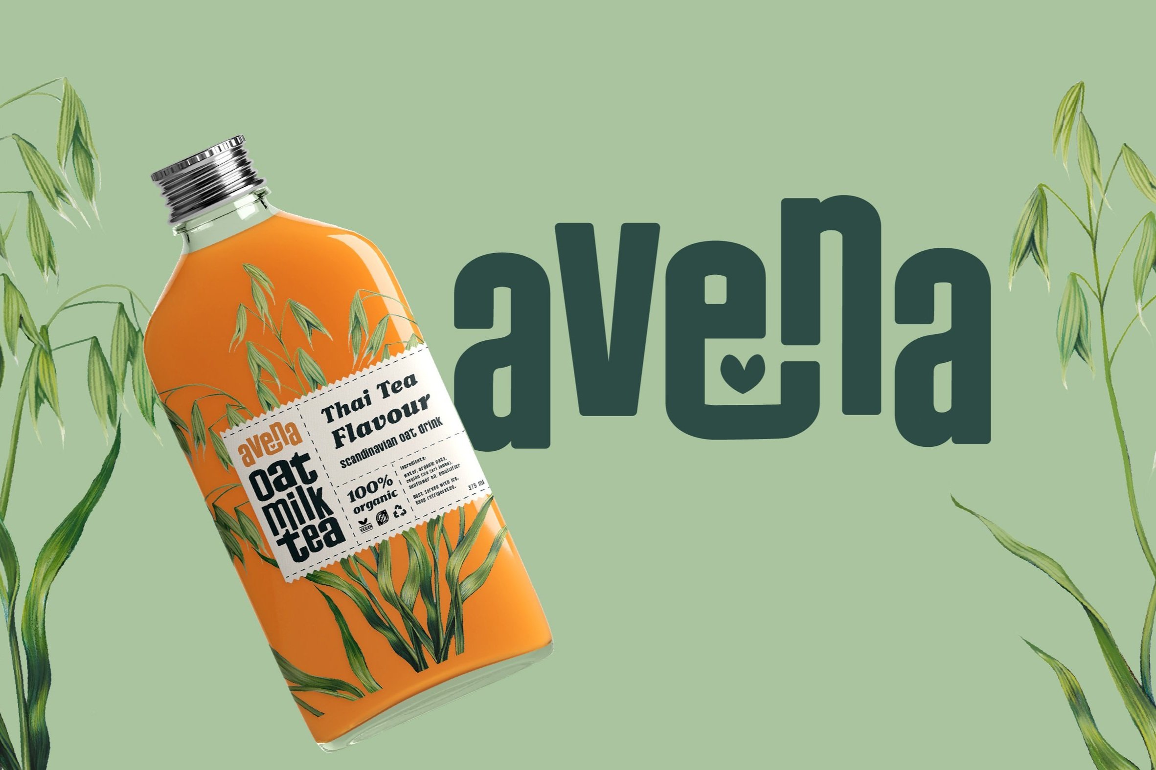
Avena is a case study oat milk brand - with a new thai tea flavoured variant.
Scandinavia’s non-dairy beverage selection is still in its infancy, and the existing products lack variety. It’s time to put a nordic spin on an eastern classic.
The brand targets millennials in the ages 25-35 who want to make conscious desicions for their health and planet without skimping on taste or experience. They know a happy and fulfilled life is made out of many small happy moments - and take pride in carefully curating these moments to fit with their personal identity and style.

The Illustration
I created a botanical style illustration to go with the packaging. I wanted the viewer to at a glance see that this is a plant based product, and to think of it as natural, artisanal, and high-quality.

Moodboard & Brand Colours
For the brands colours I wanted to create something balanced, natural and invigorating. The natural greens tie the brand back to its plant origins, without becoming overpowering. The orange is the color of the product itself, while balancing the greens and beiges with something more energetic and fun. The result is a harmonious and versatile color palette that will feel modern and approchable to our target audience.

Package Label & Type
I chose two typefaces that are both stylized, and with a vintage feel. Because of the stylized types and the intricate illustration I wanted to keep the rest of the label clean, yet quirky and approachable.
I did this to create a sense of familiarity, because the flavour is new to nordic palates and stores. The label is designed as a tear-off label with a beige color, to have the viewer associate the product with something hand made and natural.

Interested in a similar illustration or branding? Reach out and tell me about your project at emmelibm@gmail.com